How the psychology of color can improve hospitality design
The psychology of colour is a fascinating thing.
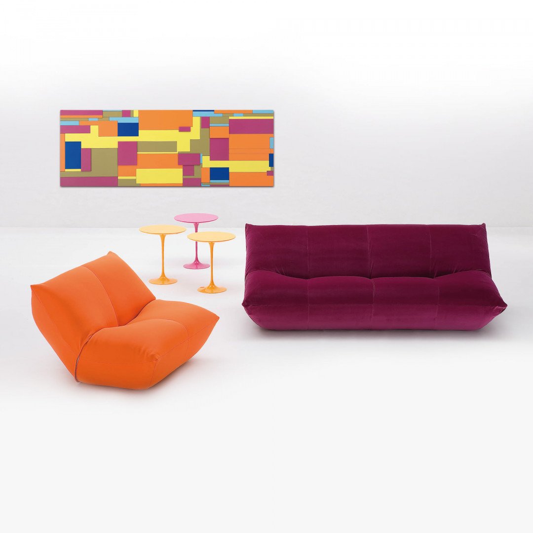
It’s long been proven that different colours can have an effect on our moods and actions.
But have you thought about how incorporating the psychology of colour into the design of your hospitality spaces may affect your guest’s behaviour?
What vibe do you want to create? Are you an upbeat and energetic space, or a chilled-out, spa-like establishment? Perhaps you have a multitude of these areas within a hotel, for example. Here’s a rundown of how each colour affects us, and how you can put it to use in a positive way.
Yellow
Yellow has long been associated with happiness. It boosts creativity, and optimism and creates cheerful energy. It’s thought to be a great choice for breakfast areas as guests can get a positive feeling to start their day, and is great for lobbies or reception areas as guests arrive. It can be a little too much at times, however, so accents of the colour are a good idea.
Blue
Blue is a very calm and serene colour. It reduces blood pressure and heart rate which can actually reduce appetite – so not a great choice for your restaurant or dining area. It’s one of the most productive colours, so works brilliantly in an office or meeting room space where people need to concentrate. As it’s very relaxing, blue can often be found in spas and bedrooms. It’s dependable and secure, yet, too much can be depressive. We guess that’s why they call it the blues…
Red
The fiercest of the bunch, red is a bold, intense hue. It’s the high energy, so fantastic for areas that require physical activity such as a gym. As it raises heart rate and blood pressure, it can actually increase appetite, so is widely used in restaurants and dining spaces. Of course, too much of anything can be a hindrance, too much red can be overstimulating for guests.
Green
Green reminds us of nature. It’s tranquil and represents balance, so it’s great for areas of decision-making, like boardrooms. Its positive energy and soothing abilities make it great for bedrooms, spas and outdoor spaces. Green also represents wealth and abundance.
Purple
The royal colour, purple is dignified and dramatic. It symbolises luxury and richness, so is great for grand establishments. It also has a calming effect when used in its lighter shades, so can be a great choice for lobbies or welcome areas. Be warned though, purple can actually be an appetite oppressor, so not a great choice for your dining space.
Customise with SeelTeen
Thinking of redesigning your space? There’s no need to get the paint out. With a huge variety of fabrics and finishes, we can help you create the right furniture to suit your need. Make sure guests arrive happy, and leave wanting to return.
Welcome to contact us to get the latest price list!
Do you need to read another article? Please click on this: Make hotel room feel homely
Find us on Facebook, Instagram and don’t miss a single breath


